

Results
Summary and Conclusions
The most common finding across all the data was a relationship between population density and all the other variables. All of the major cities had lower rates for all three chronic conditions, as well as contributing factors. The only exception to this rule was a hot spot in the Atlanta area for heart disease. Another common theme was the high prevalence of all chronic diseases as well as contributing factors along the I-95 corridor. This area has long been known as the "Corridor of Shame" in the public health world for its high values of chronic conditions.

Geographic Weighted Index for Heart Disease, Hypertension, and Diabetes
The index value shows a combination of variables to show the highest values for similarities. The normalization data is displayed as a scale from zero to one so the data can be compared across all three chronic conditions variables, with values closer to one being an area of higher prevalecne and values closer to zero being lower prevalence.
The darker areas in the index map show high prevalence for a combination of the chronic conditions. The darker areas are higher values, and like the other factors, appear the most in rural areas.
Choropleths
Choropleth maps show spatial distributions across a geographic area. In the maps below, areas with higher values are symbolized with darker colors and areas with lower values are symbolized with lighter colors. Heart disease, hypertension, diabetes, obesity, and physical inactivity are shown.
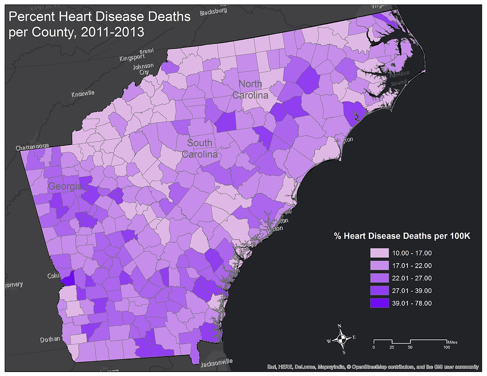
This map shows percentage heart disease death. High values for this factor are spread out more than other factors in the study. The data shows that 10-78% of the population died from heart disease in the county of study. All three states are slightly the average death rate for South Carolina and Georgia is 22% whereas North Carolina is 21% death from heart disease. The high value of 78% occurs in only one county.


Hot Spot and Outlier Analysis


This map shows the percentage of the population that lives with diabetes. Many of the areas are clustered on this map. There is a lower prevalence of diabetes in most metro areas, and a higher prevalence in rural counties. All three states are above the national average of 9.3%. North Carolina and Georgia each have an 11% prevalence rate and South Carolina has a slightly higher prevalence rate at 12%.
This map shows hypertension death rate percentages. Like heart disease, hypertension has a wide range of values that are somewhat dispersed. Again, the high value of 72% is an extreme outlier. South Carolina and Georgia are both among the top 10 states in the country for percent population with hypertension at 37.8% and 36.2% respectively. North Carolina is only barely out of the top 10 as well, coming in 11th in the country with a rate of 35.2% of the population having hypertension. These are all consistently higher than the national average, 33.5%.
While not one of our chronic conditions of study, obesity is known to contribute to hypertension, heart disease, and diabetes. Note how many of the high values for obesity are also high values for the three chronic conditions, especially along the I95 corridor. Many densely populated counties also show lower rates of obesity.
Like obesity, physical inactivity is not one of the chronic conditions of study but it does contribute to all of them. Many of the high values for physical inactivity occur in the same place as the high values for the chronic conditions. Again, many densely populated areas show a lower prevalence of inactivity.
Hot spot analysis is used in order to further define where statistical spatial clustering occurs. A cluster and outlier analysis is was used to identify extreme data values present in the data.
High values for diabetes are observed the most in rural counties, especially those in the I95 corridor. Low values are seen in most densely populated counties.
Heart disease shows similar clustering to the other chronic conditions with the exception of Atlanta and the surrounding areas, which show a much higher level of heart disease as compared to a lower level typically observed in and around big cities.
There is far less clustering for hypertension than for diabetes. Most of the high values still occur in rural areas, but there is less low value clustering around cities than with the other chronic conditions.


Grouping
Grouping sorts data based on common attributes and places those with similar attributes into the same group. Grouping seeks to make those within a group as similar as possible and different groups as different as possible.
The grouping analysis statistically shows as what the other data has shown visually. Counties that are densely populated, those with major cities, are all in one group. This is true for Atlanta, Savannah, Charleston, Columbia, Rock Hill, Charlotte, Raleigh, and Wilmington. In turn, most of the rural counties are in the same group, including all those along the I95 Corridor. Grouping is important because it shows us which areas need specific targeting for chronic conditions across a multitude of contributing factors.
OLS Regression
Ordinary Least Squares (OLS) helps to show the model of best fit and then predict areas expected to be high and low values, based on standard deviations from a mean. OLS shows a dependent variable and the variance it as from a set of explanatory variables.
The counties shown in red symbolize a positive relationship between the variables of study while the counties in blue symbolize a negative relationship between the variables. This model explains the areas around the major cities well, but the results in the more rural areas are less telling.